 Skip to Main Content
Skip to Footer
Skip to Main Content
Skip to Footer

You’ve got a product or service. You’ve got all your business systems in place. You’ve got a website in the works. You might even have a logo and a rough idea for how your branding will look and feel.
Have you thought about colors and palettes? This might seem trivial. Yet, like the bow on top of an already wrapped gift, it’s still the first thing people will see and notice when they drop by your site.
Colors evoke subconscious feelings and emotions. They can be wildly pleasant on the eye or harsh and uninviting. A color scheme might remind consumers of a brand that isn’t your own, or work double-time to set you apart within your industry. There’s a lot to consider. Here’s where to start.
Color theory and the basics

Photo from Shopify.com
Sometimes you land on a site and everything works in harmony. The fonts, the layout, and colors all coincide cleanly and effortlessly. Without a basic understanding of colors, you simply won’t be able to achieve a smooth aesthetic.
It starts with understanding color theory and the principles behind pairing colors. Color is broken down into three tiers: primary colors, secondary colors, and tertiary colors.
The guidelines for primary, secondary, and tertiary colors are terrific basics to keep in mind, but only result in a handful of pure colors. Of course, you will need to venture off into various tints and shades of to find a palette that matches your brand identity and gives you an original look.
By mixing in white, black, and hues, you get lighter and darker tones out of basic colors. This is where you can start to get creative.
When faced with the daunting options in a color wheel, you might feel a bit uneasy. We do too. Clicking and dragging a point across a color wheel feels like a guessing game to land on a shade of color that looks and feels authentic.
You can employ simple rules to help guide you while selecting colors and palettes. An analogous color scheme is created when one color is paired with two neighboring colors on the color wheel.
This might look like blues, purples, and greens paired together or reds, oranges, and yellows.
Unlike analogous color schemes, complementary colors are directly across from one another on the color wheel. These colors work well together, but need to be carefully selected as they will have a much higher contrast than a softer, analogous color scheme.
Green and magenta or blue and yellow are examples of complementary colors.
The psychology of color in marketing
It is said that it takes someone roughly 90 seconds to assess a brand or product. Over half of their total judgement is decided by the colors alone. So while logos and taglines and structure matter in a website, if your colors are off, the consumer will feel off too.
This Truelist.co infographic beautifully lays out why certain brands use the colors they do and the general feelings and effects specific colors can exude.
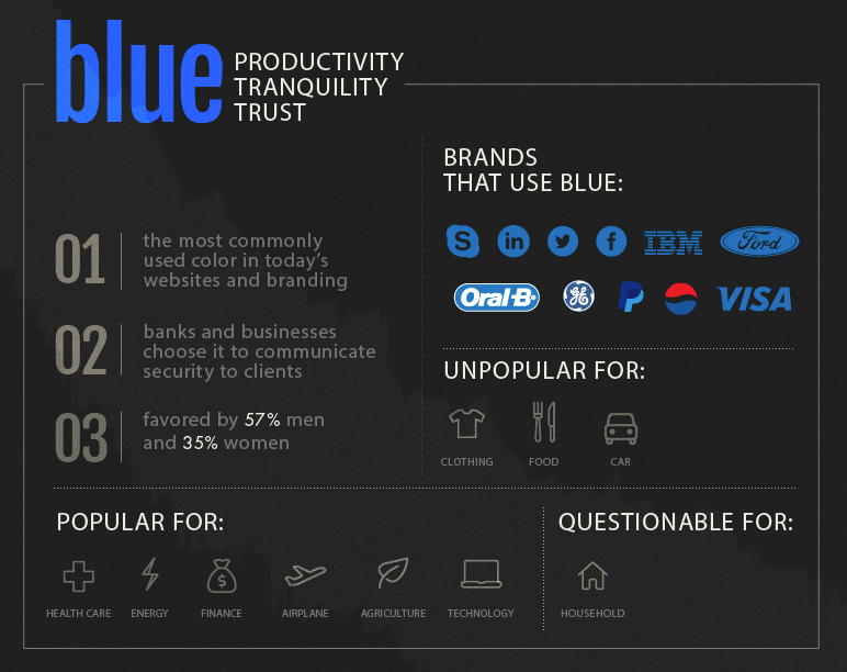
Graphic from truelist.co.
Red can signal, boldness, aggressiveness, and confidence. Green can point to nature and a feeling of harmony or approachability. Each color comes with subtle emotions attached, swimming around in our subconscious, affecting us in ways we might not think about.
Start by picking out some adjectives that describe your brand identity and the tone and feel of your business. Next, translate these into a couple colors that accent one another well. From here, try playing around with different shades, tones, and hues. Put them side by side and see how they fare. Type up a description and see if you can read it clearly and easily.
Beyond the colors you choose to represent your brand, you must also consider colors you choose to draw attention to your CTAs (calls-to-action). Your website, your emails, and anywhere else you are asking someone to take action, needs to be highly visible and inviting.
Think copy is the only factor in getting more conversions? Think again. Look at the impact color had on these real life CTA examples for different brands.

Graphic from Truelist.co
VegasSlotsOnline.com saw a whooping 175% increase in conversions simply by changing their sign up button from green to yellow. It also seems that a red button with white text draws in consumers the most successfully when compared to other options..
Coffee brand BLK & BOLD did well to create a color scheme that’s exactly that: bold. Look at the way the black and gold explode off the white backdrop. It’s a high contrast color scheme that’s simple, works well, and can be employed across all of their branding. They also used a red banner with white font to jump out even further and demand to be read.

Photo from Shopify.com
Be thoughtful with how your colors communicate your brand. Start by checking out other beautiful sites for inspiration and noting how certain colors made you feel when you landed on a site. A polished, conscious aesthetic goes a long way...and that starts with color choice.
Leave a Comment